
Testaankoop Gezond / Testachats Santé
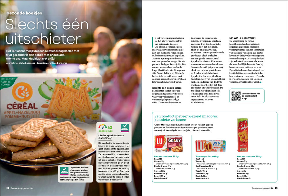
It is always a pleasure to work for print; Here the challenge was to clearly make a distinction between the really healthy biscuits (left image), the biscuits with a healthy "image" without being so in reality (middle image) and two products that don't claim to be healthy but are more healthy than the one who claims to be so. All this in two pages.
With no time or budget for a real photo shoot, AI imaging allowed me to seamlessly integrate the most healthy product into the main image. This avoids image redundancy, makes clever use of the total amount of limited page space, while still keeping a comfortable amount of white space.
ARCHIVAL PRINT MAGAZINES
(A)way magazine was an expat magazine in Belgium. It was in need of a restyle so it was the occasion to streamline it a bit. Even if the physical format was rather small it was the idea to make it look as a condensed "big" lifestyle magazine. It's one of the several projects that I entirely (re)built from scratch. Logo, restyling, picture style guidelines, and finally the entire lay-out.
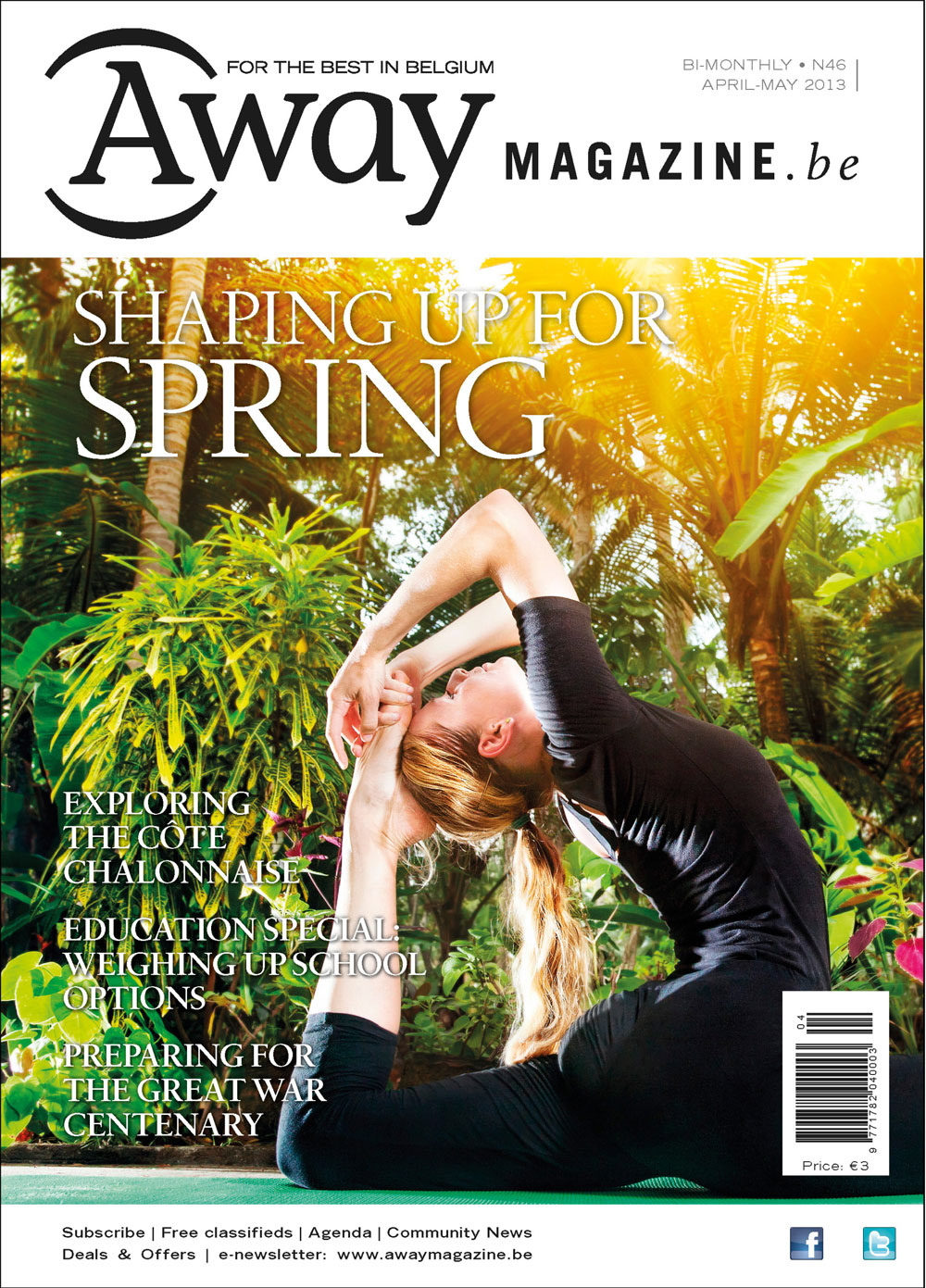
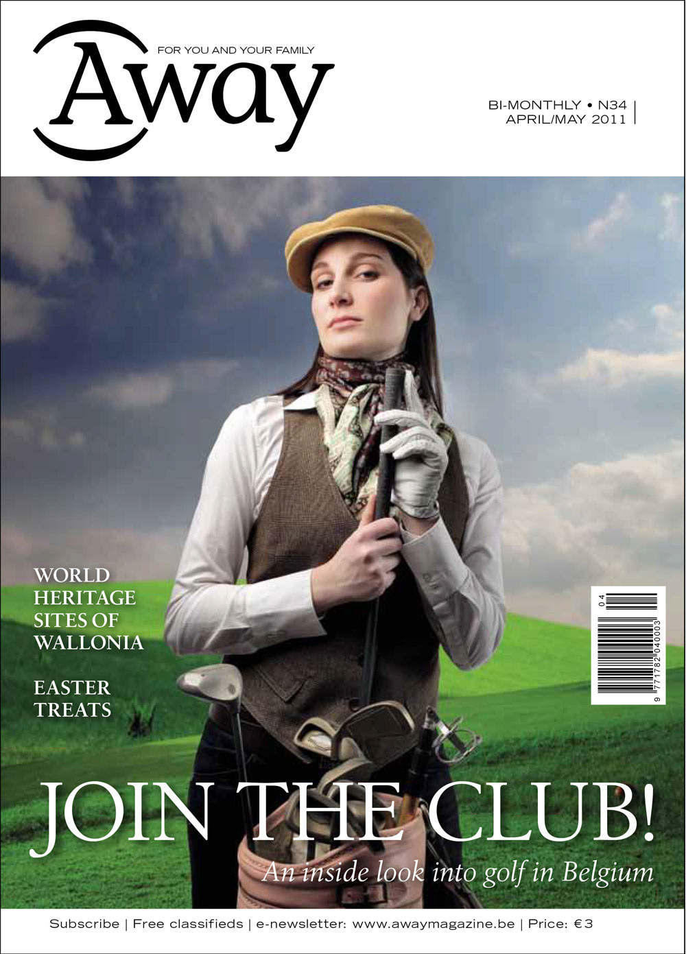
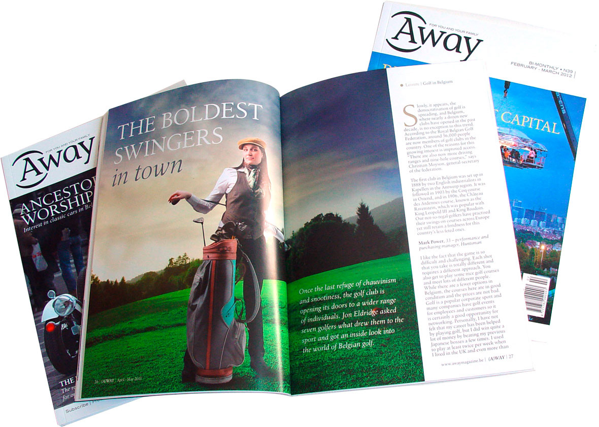
Also, technically it was interesting because for the first time II experimented with an entire RGB workflow for the pictures. So the Colour Profile was only added in the last "export to PDF" stage. No risks were taken because it was tested with the printers before and the results were perfect. If necessary only one version would have been necessary to print the magazine anywhere in the world and get a good colour result. Not to mention the server space saved and the convenience of non destructive .psd files directly placed in Indesign..